What do you do when you think you’ve crafted the perfect landing page for your killer lead magnet, it goes live and just…
Sits there?
No conversions, no interest.
Or at least not the massive influx of downloads you were expecting.
What then?
You’re wondering what could’ve possibly gone wrong…
Don’t spiral into despair just yet.
We’ve got 10 key reasons your landing page isn’t converting and what to do to fix them:
- Your Offer Isn’t Good Enough to Incentivise a Lead
- You’re Asking Too Much of Your Visitor
- There’s No Incentive to Act Right Now
- Your Headline Is Boring
- Your CTA Isn’t Effective
- Your Messaging isn’t Consistent Throughout Your Funnel
- You Haven’t Built Enough Trust
- You’re Targeting the Wrong Audience
- Your Landing Page Isn’t Optimized for Mobile
- Your Landing Page isn’t Actually a Landing Page
LET’S TALK ABOUT YOUR OFFER
#1. Your Offer Isn’t Good Enough to Incentivise a Lead
That’s right. You might’ve just missed the mark on this one and created an offer that just doesn’t entice your audience to hand over their details.
Remember: We’re not talking about sales pages here. We’re talking about landing pages for your lead magnet so you’re most likely asking your audience for their email address in exchange for your content.
So, how can we fix it if your audience just isn’t handing over their emails?
You Need to Enhance Your Offer With Something Juicy
You need to consider here if what you’re offering is worth your audience handing over their personal details.
Everyone knows that data is the most valuable thing on the planet right now, so you need to give your audience a good reason to hand theirs over to you.
If your lead magnet isn’t collecting those leads right now, try thinking about these questions:
- Do you have any other content that you could bundle into your lead magnet to make it more enticing?
- Can you create scarcity with a limited-time campaign to get their hands on your lead magnet?
- Am I offering something they can’t find for ‘free’ elsewhere? (and by free I mean without exchanging their data for your product)
#2. You’re Asking Too Much of Your Visitor
Here’s the thing.
We’ve all seen an ad or received an email about a free offer, checked it out, and been asked for your name, email, phone, job title, gender, age, dog’s name…
So we immediately exit the page and never look back.
The average landing page conversion rate is 2.35%.
And guess what? Landing pages that ask for personal information have the lowest conversion rates because visitors don’t perceive the offers as valuable enough to hand over that information.
Your landing page visitors are likely cold, top of funnel traffic, so the objective right now is to get them into your sales ecosystem.
That’s it.
This is why you need to create the path of least resistance, not interrogate them.
Your offer must outweigh the ‘cost’ to your prospect i.e. the amount of personal information they have to give you and the time it takes them to do it.
Yes, you might be interested to know more about your new lead but refraining from asking them at the point of sign-up can drastically improve your conversions.
Remember: If you ask your visitor to hand over more than your offer is worth to them, they will leave.
So keep it to a minimum, cut out those unnecessary fields, and only ask for the information you actually need.
#3. There’s No Incentive to Act Right Now
Your goal is to make your audience believe they can’t go any further without getting their hands on your lead magnet.
No more “I’ll definitely come back to this later”
But what’s the best way to make sure your audience is chewing at the bit to get your offer? (Aside from having a killer offer in the first place)
Make it limited.
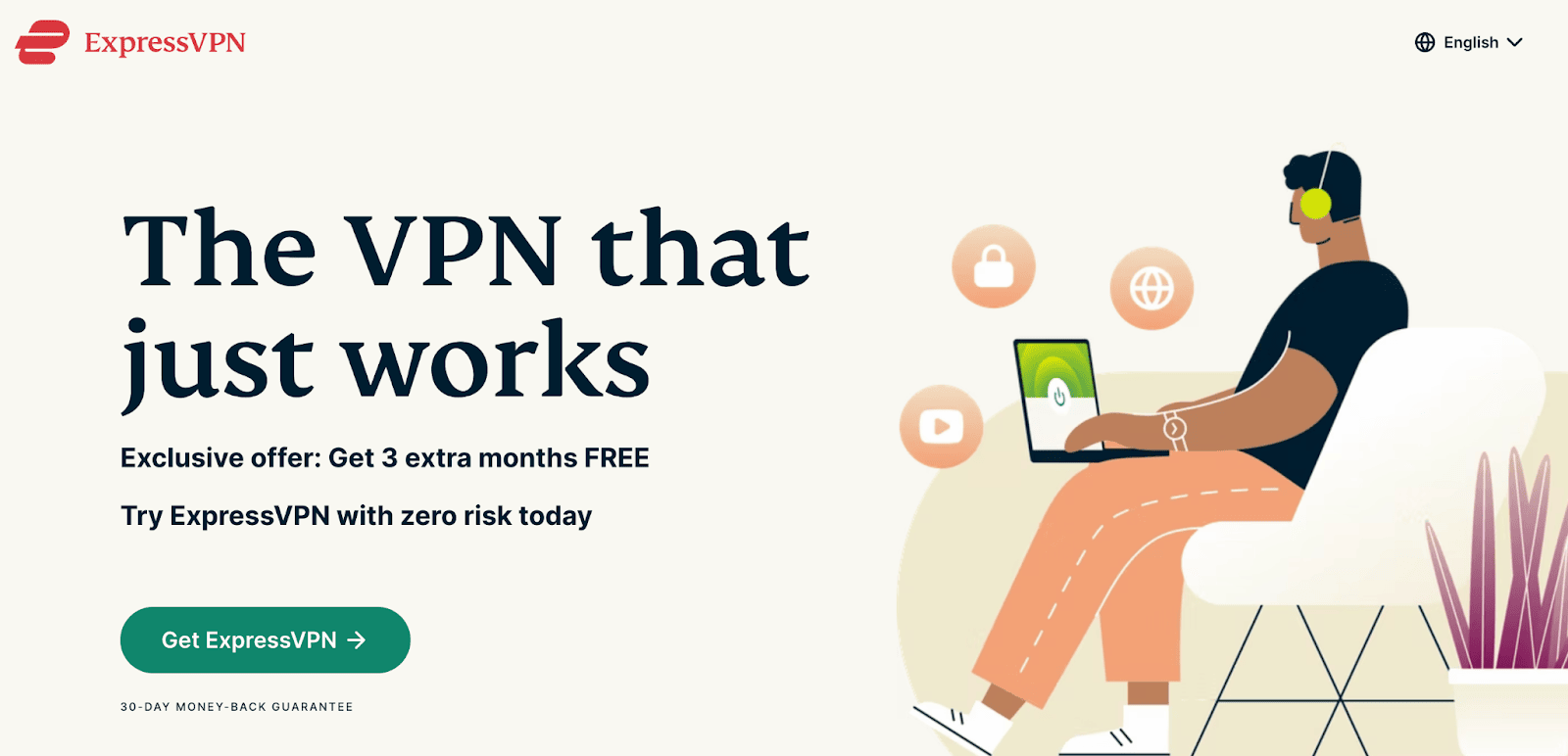
Here’s a great offer example by ExpressVPN.
It’s clear, to the point, and they know their audience is actively searching for a solution so they’ve positioned it right in the hero section.
As someone who uses a VPN (and has used a couple of truly terrible ones), a VPN that “just works” hits that core pain point right on the head. Combining that with a zero risk free trial, and a discount offer makes their audience want to hit that CTA ASAP.

Create Scarcity
Now, there are 3 types of scarcity you can combine together or use on their own.
But if you’re not using at least one, you’re definitely missing the chance to capture the dawdling members of your audience who always think “I’ll sign up for that later”.
Here’s a quick round-up of the 3 types of scarcity you must know:
Limited time offers: The clue is in the name with this one. If your countdown timer shows your audience they only have 4 hours until this juicy free content goes away, they’re much more likely to snatch it up than if they think they can come back tomorrow or next week and get it then.
Quantity scarcity: Especially powerful with physical products where there is a legitimate limit to the number of products available, or services like coaching spots as a coach has limited hours available.
Premium scarcity: (limited time bonuses)
Remember: Only use scarcity if it actually exists. Creating fake scarcity is shady AF and a sure-fire way to lose trust. If the offer isn’t going away tomorrow, don’t put a countdown timer on it. If your special limited bonus will be available again next week, it’s not a special bonus.
Still not sure if you’ve crafted the compelling offer that’ll land you with an email list full of prospects?
Well how does our hot take on your copy sound? Get 3 FREE recommendations you can put into action right now >> HERE.
Now you’ve got your offer down to a T…
NOW LET’S TALK ABOUT YOUR COPY
#4. Your Headline Is Boring
You only have 8 seconds to make an impression on a landing page.
And truly, I think that’s a generous estimate.
You need to do everything in your power to engage your visitors as quickly as possible (and keep it – but more on that later).
So of course, your headline is your first attack.
Focus on Your Audience, NOT Your Brand
Let’s be brutally honest here.
Everyone cares about themselves first and foremost.
That means your prospect cares about themselves as well, not your brand. So if you dive right in and use your headline to call out anything about your brand, what you do, and what you stand for…
They’ll probably leave.
We’ve already talked about how your headline has to immediately connect with your ideal audience.
So, your headline should reflect either their pain or what benefit you can bring to them in exchange for entering their information.
But how do you know whether to lead with a pain-focused or benefit-focused headline?
What Stage of Awareness is Your Visitor?
The 5 Stages of Awareness is a fundamental copywriting framework defined by Eugine Schwartz in his book Breakthrough Advertising. (The book itself is pricey and pretty hard to get hold of but you can also find a lot of info about the concepts online for free)
The key thing you need to know right now is where in the 5 stages your prospects lie, so you can determine what type of headline you should lead with – and drive the whole structure of your landing page.
So, are they unaware, problem aware, solution aware, product aware, or most aware?
Here’s a quick breakdown of the 5 stages:
Unaware: They have no idea who you are as a brand or even that they have a problem to solve.
Problem aware: They know they have a problem to solve but not how to solve it.
Solution aware: They are actively seeking a solution to their problem.
Product aware: You guessed it, prospects at this stage are aware of your brand, the solutions you provide and why they should choose you.
Most aware: These prospects are the easiest to convert. They know all about what you provide, have probably purchased from you before and believe in what you offer.
So why does all this matter?
Every message, especially your headline, needs to correspond to the awareness level of your target audience.
For example, if your audience is in a problem aware state, which headline will perform better?
Headline A: Highlights the core problem your audience has that your lead magnet solves
Headline B: Jumps straight into the core benefit of downloading your lead magnet
Headline A will likely see better results – by calling out the problem and matching the problem-aware state of the prospect.
Does your landing page headline immediately match your visitors awareness level?
#5. Your CTA Isn’t Effective
Let’s take it back to basics for a minute.
Your call to action (CTA) tells your reader what they should do after they visit your landing page.
Where your headline got them over the first hurdle, your CTA gets them over the last hurdle and clicking that download button because, well… it literally is the button.
So, to make sure your visitors aren’t scratching their heads wondering where to click or what you even want from them…
Your CTA needs to:
- Have clarity
- Match your audience’s expectations
- Be seen
But what does that actually mean for you?
Remove the Fluff
Keep it concise. Short. Straightforward.
Putting multiple offers on your landing page can decrease conversions by up to 266%.
Your landing page should have one single, clear CTA. That’s it.
Whichever way you want to look at it, your CTA needs to tell your audience exactly what they’re getting if they click that button in the clearest and most compelling language possible.
Don’t Bate and Switch
This is all about message matching.
Does the promise you make in your ads match the actual CTA on your landing page?
If your prospect doesn’t get what they’re expecting, then you’re compromising trust with your audience.
Design Your CTA For Conversions
It goes without saying that your CTA has to stand out – So why do so many businesses miss the mark when it comes to designing it for conversions?
Here are my top CTA design rules:
- Give it some space: Calls to action surrounded by more negative space and less clutter can actually increase a company’s conversion rate by 232%.
- Make it a button: Use contrasting colours, bold font, and an actual button box to make it stand out from all the other text on the page. CreateDebate saw a 45% boost in conversions from doing exactly that.
- Place it where your prospect is most poised to say yes: Some people are fast decision-makers, others need a little more persuading before they say yes to your offer. So make sure you position your CTAs for both types of people.
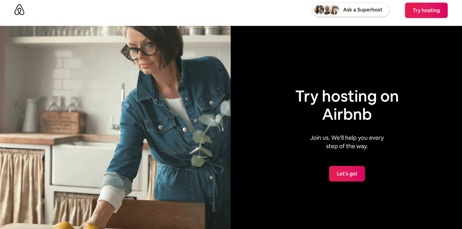
Airbnb does a great job at designing their CTAs for conversion – only using their signature pink logo colour for their main CTA on their landing pages so that they’re super highly contrasted to the rest of the page.
The main CTA also pops up in the navigation bar as you scroll, so that their visitors never have to search for the button anywhere on the page.

Click to check out the full page.
#6. Your Messaging isn’t Consistent Throughout Your Funnel
It goes without saying (but I’ll say it anyway) that your messages have to be consistent throughout your whole funnel.
Your ads need to tell your audience what they’ll find on your landing page.
Your landing page has to make it abundantly clear what they’re getting in exchange for their information.
And so on, throughout your entire sales funnel.
If it’s not consistent then your audience ends up confused, skeptical, and ultimately leaving.
Does Your Messaging Follow My Top 3 Rules for Consistency?
- Use the same tone of voice throughout: If you haven’t established your brand tone of voice, think about who your brand persona is and the qualities you want to portray in the type of language you use
- Stay on-brand: With design features like your colours, images, font
- Use open loops effectively: Whenever you open a loop or make a promise, always close the loop or follow through on that promise in the next stage of their journey
Are you struggling to create consistent messages for your audience? At Write Beyond, this is exactly the type of problem we solve every day through in-depth discovery of your customer’s tone of voice and the messages they need to hear so you get the “yes”.
To find out more, check out our Sales Page Copywriting Services.
YOUR AUDIENCE
#7. You Haven’t Built Enough Trust
The purpose of a landing page is usually to exchange something in return for a lead magnet, your customers need to trust you to hand over their email/details
Picture this, you get a Facebook ad from a company you’ve never seen before, or who have been pushing loads of sales ads to you recently…
They’re offering a free mini-course that looks pretty interesting. But you don’t really know their brand, what they’re about, or if they’re just going to spam you with sales emails for eternity.
Would you give them your email address?
Of course not. Because you don’t trust them.
And trust is everything.
Building trust with your audience can be done in a lot of ways, on the page and by consistently putting out valuable, free content before your prospects ever even reach your page (but that’s for another post).
Let’s focus on what you can do on the page to build trust in the moment.
Use Social Proof
88% of consumers trust online testimonials and reviews as much as recommendations from friends or family.
That’s huge!
And gives you the perfect opportunity to use this to your advantage by gathering as much social proof as possible to share with your audience.
That includes:
- Testimonials
Try offering your gated content out directly to people in your audience to collect their opinions that you can share on your landing page.
BONUS: Ask them if you can include a photo as well. It’s a well known hack to increasing conversions by showing your audience actual faces of people just like them.
- Proof Bars
Have you been featured in a reputable blog or publication your audience will know? Or how about working with a well-known brand?
Boost your credibility by showing your audience logos on the page of people they trust who have trusted you.
This is a great example of a powerful proof bar from Mailchimp. They’re indicating to their audience that everyone is using Mailchimp – so why aren’t you?

Include Contact Information
This is a really simple way to demonstrate you’re a legitimate company with nothing to hide.
Just make sure your company name, registered office address, contact email, and phone number are in your page footer.
A really simple tactic that doesn’t have a huge effect, but will tick a box in your audience’s subconscious that tells them they can trust you.
#8. You’re Targeting the Wrong Audience
Deciding who you’re going to target is a huge topic in itself, so we’re just going to tackle the basics here.
If your landing page isn’t converting, consider whether you’re actually targeting the right audience who resonates with your content.
If you think this might be your problem, try tweaking the audiences you create for your social media ads.
Some audiences to try could be:
- Followers who have engaged with your content in the last X days
- People who have downloaded other free content from you before
- Past customers who have purchased your products or solutions
- Lookalike audiences of the above to try and capture new prospects
Disclaimer: These are just suggestions to get you thinking. We’re not ad experts here at Write Beyond, so consult your resident expert or ad agency about your ad segmentation.
BONUS: YOUR DESIGN
#9. Your Landing Page Isn’t Optimized for Mobile
As of May 2022, mobile accounted for over 60% of web traffic.
Which isn’t surprising, nor is it going to decrease any time soon.
And since your funnel will likely involve driving traffic from social media, not optimizing for mobile quite frankly just throwing money down the drain.
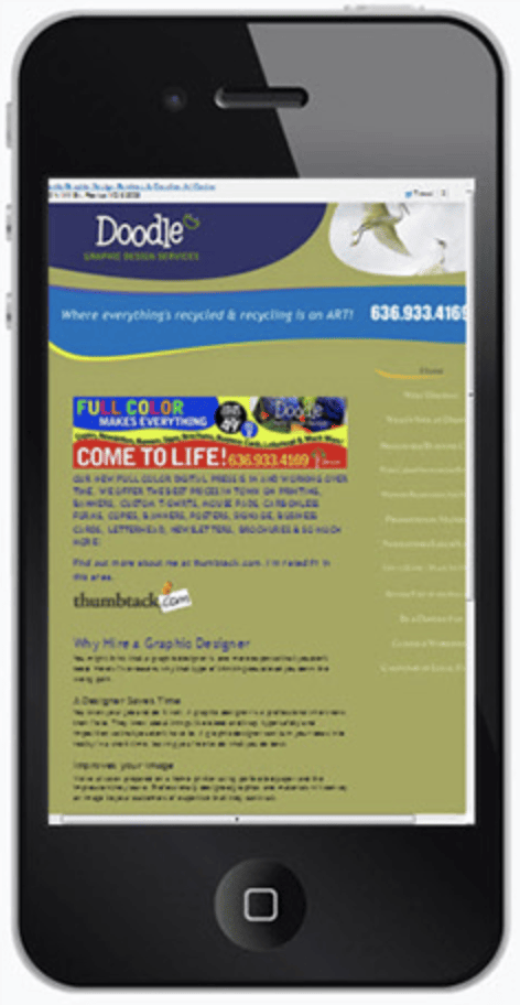
So if your landing page looks like this on mobile:

Then you don’t stand a chance until you create a design that is mobile-friendly.
Keep it Simple
You or your designer might want to show off your skills but an intricate design, bouncing graphics and a rainbow of colors all create mega distractions and confusion.
A distracted or confused audience isn’t a converting audience.
Keep it simple, on brand and don’t pull attention away from your core messages.
Have You Got Lightning Fast Load Times?
Every. Second. Counts.
The longer your load time, the more visitors you’re losing, literally by the second.

The best way to test for mobile-friendliness is the actionable recommendations from Google themselves. Check it out here.
I’ll say no more – just go check, ok?
#10. Your Landing Page isn’t Actually a Landing Page
Often, people use the term landing page to describe literally any page on the internet.
In actual fact, a landing page is a single page designed with a single CTA to capture leads.
That’s it. Plain and simple.
Hick’s Law states that the more option you give people, the longer it takes for them to make a decision.
That’s why the whole purpose of a landing page is to take away their options and direct them to a single action – Giving you their email in exchange for some form of value.
So, let’s make sure your landing page is actually a landing page with these 3 checks:
- Remove any navigation: The one and only place your visitor should be able to navigate to is the page your CTA button leads to.
- Remove any outbound links: Again, do not give your visitors any reason to leave your page and forget to enter their details
- Check your CTA again: Is it clear and is there only one CTA that appears multiple times on the page?
If you’re actually working with a full website and not a stand-alone landing page, we’ve got that covered in this blog post on website copywriting basics.
Test, Test, Test
This isn’t a reason your landing page isn’t converting but it sure is going to help you fix it.
Test whenever and wherever you can. You can do all the research in the world and create what you think is a perfect landing page, but behaviour and preferences change. So at the end of the day, it’s a continuous working hypothesis.
You’ve taken an educated guess at the messages that’ll resonate with your audience, the design and placement that’ll work, and the CTA copy they’ll click.
So testing your hypotheses allows you to keep learning about your audience over time and adjust your messaging accordingly.
What and How Should You Split Test?
You can test just about anything on your page with A/B testing – anything from your headline and button copy to design elements and the order of messages.
But the most important thing to remember is only A/B test one element of the page at a time.
Otherwise, you won’t get conclusive results about which change actually boosted conversions or not.
Refrain from jumping to conclusions too quickly and updating your control page based on a tiny sample size because one person converted on your test page.
Take this example from RJMetrics.
They tested a variation B of their pricing page…and it crashed and burned.
62.5% of visitors interacted with the input field, but only 1.2% of them signed up.
So their next hypothesis was to move the sign-up button above the fold. And it beat the original variation B by 310%.
That’s the value of testing, testing, and testing again.


